December 27, 2024
In the dynamic world of quality engineering (SQE), identifying and addressing root causes of defects is paramount. While a multitude of tools exist, the Pareto chart stands out as a visually compelling and data-driven approach.
Inspired by the 80/20 rule, the Pareto chart emphasizes that a small percentage of causes often contribute to a disproportionately large percentage of effects. In a manufacturing setting, this translates to a few key issues likely responsible for the majority of defects.
Benefits for the SQE:
- Clear Communication: Pareto charts excel at conveying complex data in a simple, digestible format. This is invaluable when presenting findings to stakeholders, from shop floor workers to senior management.
- Continuous Improvement: As corrective actions are implemented and data is updated, the chart dynamically reflects the changing landscape. This allows SQEs to continually monitor progress and adapt their strategies.
- Prioritization Power: By highlighting the most critical issues, Pareto charts empower SQEs to make data-driven decisions and allocate resources effectively. This ensures that improvement efforts are focused where they will have the greatest impact.
- Validation of Efforts: By comparing pre- and post-intervention Pareto charts, SQEs can objectively demonstrate the success of their quality initiatives, providing valuable justification for future projects.
How to Utilize Pareto Charts:
- Data Collection: Gather accurate and comprehensive data on defects, classifying them into meaningful categories.
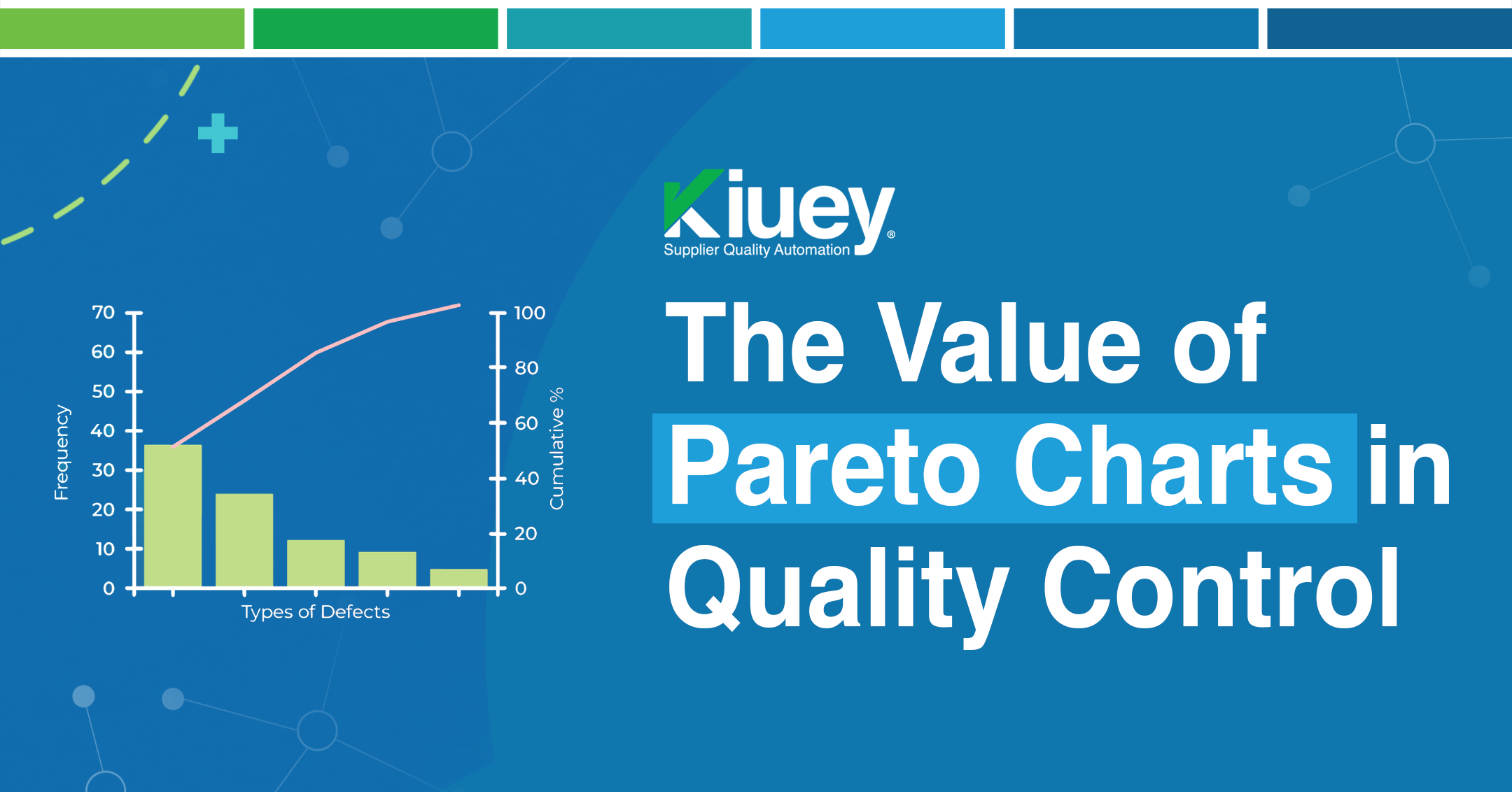
- Chart Construction: Arrange categories in descending order of frequency on the horizontal axis. The vertical axis represents the frequency of occurrence.
- Cumulative Percentage: Add a secondary vertical axis to display the cumulative percentage of occurrences.
- Analysis and Action: Identify the “vital few” categories contributing to the majority of defects. Focus improvement efforts on these areas.
- Continuous Monitoring: Regularly update the chart with new data to track progress and identify emerging trends.
In Conclusion:
The Pareto chart is a powerful tool for any SQE seeking to drive continuous improvement. By visualizing the impact of various factors, it empowers data-driven decision-making, resource allocation, and effective communication. By embracing this simple yet powerful tool, SQEs can significantly enhance product quality, reduce costs, and ultimately improve customer satisfaction.
Subscribe to our newsletter.
Your go-to destination for insights, best practices, and innovative solutions in supplier quality assurance.
Let's talk to see how PPAP Manager can help your company to save time and money.


